As data has grown in presence and importance, fields like Business Intelligence (BI) have grown in unison. In this heavily data-driven industry, BI professionals want to tell a story to their respective audiences. One of the best ways to tell each of those stories? Natural language generation (NLG).In the past year, NLG has exploded among BI users. We released integrations with Excel, Tableau, TIBCO Spotfire, and most recently, MicroStrategy. In becoming part of the BI ecosystem, we have seen that there are two prevailing schools of thought as to how NLG should be integrated with BI tools: Generic Chart Explainers and Custom Narrative.
We thought it best to preview this NLG matchup and bring to light some misleading features, common misconceptions, and the best way to use this type of solution with your BI tools.

Team Generic Chart Explainers
Generic chart explainer tools try to capture metadata around a prescribed set of chart types and explain them in a completely nonspecific way. It’s a rudimentary and brute force application of NLG technology, but that isn’t the only problem with a chart explainer.
“The whole is greater than the sum of its parts.”
BI professionals build dashboards to visualize how a complex dataset, with many dimensions, changes as a whole over time or reacts to filtering or updates in reaction to changes in the underlying dataset. The old adage “the whole is greater than the sum of its parts” is particularly relevant to dashboards. After all, if this weren’t true a dashboard wouldn’t be necessary at all. Simply explaining charts adds no value to a dashboard. It misses the entire reason that dashboards are built in the first place and, what’s worse, it presumes that dashboard users are incapable of reading a chart.

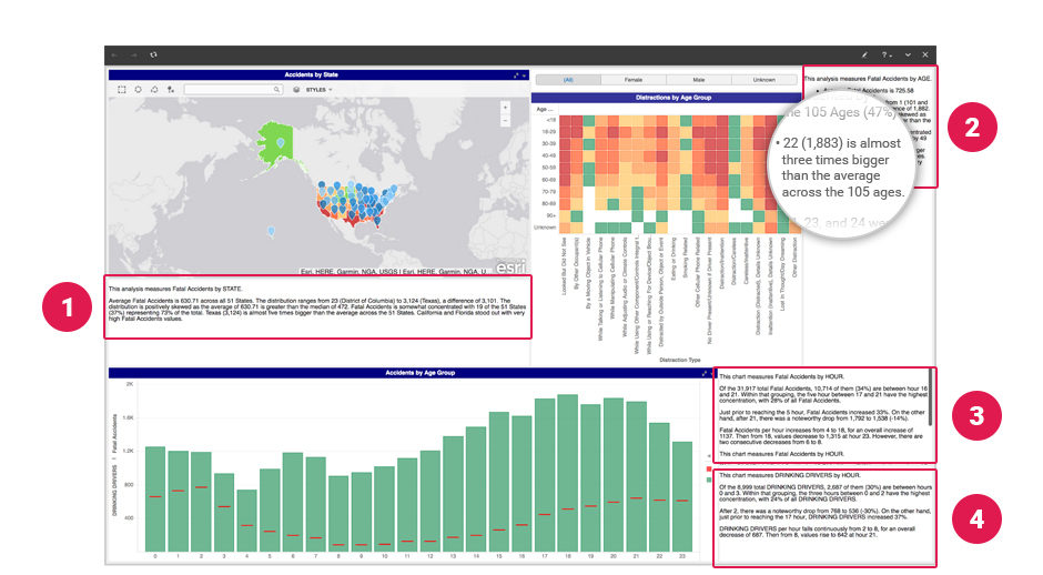
Take the above as an example (*note: this narrative was NOT generated by Wordsmith). The first thing that jumps out here is that this dashboard requires four separate narratives to explain three charts. Your dashboard is already packed with information and now you’ll be asked to more than double the number of distinct elements in the dashboard. You’ll also be asked to have your dashboard users read four separate and disjointed narratives anytime the dashboard is changed. To make matters worse, those four separate narratives don’t provide any new insight at all, they simply regurgitate what’s right in front of the dashboard user in the form of a chart and, in many cases, the narrative that gets generated is meaningless or nonsensical.
Meaningless Text Without Context
If you somehow convinced your users to agree to this, they’ll be rewarded with gems like “22 (1,883) is almost three times bigger than the average across the 105 ages.” Even if you catch that, in this context, the number 22 refers to an age, this information is useless without more information about the underlying data distribution. Knowing that there are 105 ages in the dataset is superfluous and pointless because we don’t know how drivers are distributed among those ages. Without at least knowing what the average is and how data is distributed around that average, the fact that 22 is “almost three times bigger” doesn’t really mean much. Presumably the intent here is to say that, “with 1,883 fatal accidents, drivers aged 22 years old are three times more likely than an average aged driver to be involved in a fatal accident.” While Wordsmith would have no problem building that sentence which would at least be intelligible, it’s still not helpful. No one would talk about an “average aged driver” because that is an useless metric on its face.
Team Custom Narrative
With Wordsmith, the world’s only public NLG platform, we give you the tools to turn your data into fully custom narratives that are unique to each user, allowing you to scale your data expertise. This is precisely why the Associated Press, Constellation Brands, and Yahoo! use Wordsmith. So how did we build narrative for the same dashboard using Wordsmith?

Building Cohesive Narrative
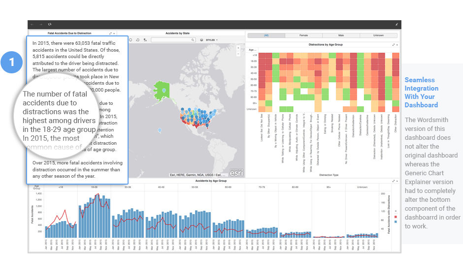
Our friends at MicroStrategy put this dashboard together and it showcases a really great use of visualizations. We spent some time getting to know the data and, from our point of view, the story here was fatal accidents due to distraction. So we took that thought and built a single, cohesive narrative around it. As a user explores and filters the dashboard using the map or the buttons, the single narrative updates in real-time using the Wordsmith API to reflect the updated state of the dashboard and it does so in a way that the user only has to go to one spot to get the full, updated story. It pulls the important parts of each visual element into one spot, talks about the cumulative effect of their individual changes, and it even identifies summer as the season that most fatal accidents due to distraction are likely to happen despite seasons not appearing in any visualization at all. Also, because Wordsmith looks at the data behind the dashboard, narratives can highlight insights that could easily be overlooked by a run of the mill chart explainer
Seamless Integration With Dashboards
The last bit to note is that the Wordsmith version of this dashboard does not modify the original dashboard whereas the generic, rudimentary chart explainer version had to completely alter the bottom component of the visualization in order to work. As a dashboard designer this is, effectively, asking you to limit your toolset. It’s saying, “whereas you once could build the precise dashboard that you wanted, you are now restricted to the most basic forms of visualization in order to generate narrative.” Asking a dashboard developer to use a chart explainer is a failure to understand why people build dashboards in the first place and it shows a woeful lack of understanding of data at its basic level.
This is why we built Wordsmith. We built it for people that understand data, people that understand that their data tells a story, and people that want to tell that story in a way that is valuable, meaningful, and relevant. Companies choose Wordsmith because they want NLG content that would be written with the tone, style, and language that they would write with. While data is ever present in our professional lives, companies use that data in wildly different ways and they want to tell stories that reflect their unique values and brand identity. That’s something that only Wordsmith can offer.
WINNER: Team Custom Narrative


